Every year new web design concepts emerge as some older trends recede. In the next months we will no doubt see a temporary increase in the popularity of video backgrounds, tiles and animated storybooks, just to name a few.
On the other hand, it’s almost guaranteed that responsive web design, a trend that surfaced back in 2010, will remain at the core of our designs for the foreseeable future.
Of course, this doesn’t mean that all web pages have to move towards a common and standardized structure. On the contrary, there will likely be more space for differentiation, flexibility and experimentation than ever before.
We have identified four trends, or general schemes, that we believe will characterize layout design in the next year. You can take inspiration from these models but the best design often comes when you use inspiration as a jumping off point for your ideas.
So, here are the trends.
The Split Screen
By “split screen” we mean all those websites where the screen is divided in two parts, usually of the same size, by a vertical section.
There are two main reasons to divide the page this way:
- To show two important characteristics.
- To express the idea of duality.
The first situation often occurs when a company has to promote a product or a service which has two equally significant features or variants. Since websites generally display elements stacked in order of importance, a more traditional layout may not be suitable in this case.
On the other hand, dividing the screen in two equal columns may be the best way to showcase two different aspects of the same system — for instance, a publishing system that is advantageous to both publishers and readers.
In this way, there is no need to distinguish between a primary and a secondary characteristic and the readers will immediately focus on what is important.
The second reason originates from the fact that sometimes, designers need to convey an idea of duality. In this case, dividing the screen in two parts creates two spaces where it is possible to concentrate on different topics or even on two different products. Also, this style makes you able to highlight opposite traits of a certain reality.
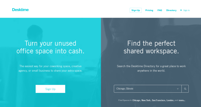
DESKTIME https://www.desktimeapp.com/
The first example we are going to see is represented by the homepage of Desktime, a company which operates in the office-sharing sector. They’ve cleaved the page in two in order to simultaneously satisfy the needs of those who already have an office, for and of those who are looking for one.
Therefore, they used the “vertical split” to put give equal stage time to two equally important features in their service. The style they have adopted is effective and practical, and it is also very linear and simple. Well done!
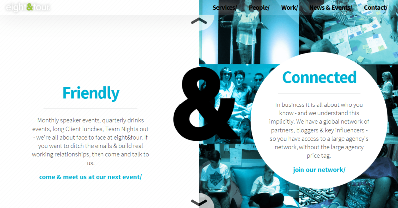
EIGHT&FOUR http://eightandfour.com/
This second example is from Eight&Four, a digital marketing company. Their homepage is also divided in two and the design is based on the contrast between white and a flat color. The division here is used to express a series of different features which are all present in the company.
The “vertical split” style is also hinged by the presence of the “&” which attenuates the division.
Container-Free Layouts
Almost since design began designers have been using elements such as boxes, shapes and lines to divide and contain content in a design. As an example, consider how headers or footers have always been designed to be visually separated from the rest of the content.
A new trend is gaining popularity centered around the idea of removing any graphic structure in favor of a more free and open style.
This trend has some common traits with minimalism but it also goes a step further. Indeed, minimalism often still uses simple, linear structures, while this new “container-less” completely strips any visual packaging.
Content itself is put at the center of the attention and the hierarchy of information is given by the choice of color, by positioning and by thoughtful typography rather than by boxes and structure.
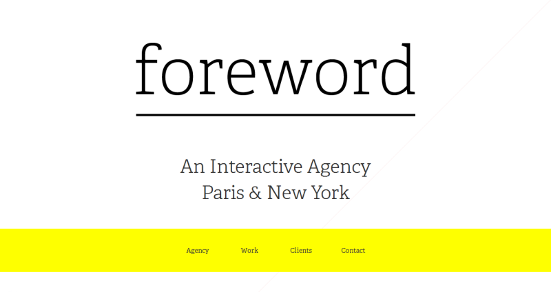
FOREWORD http://foreword.io/
As you can see from the homepage, Foreword is an interactive agency which is based in New York and in Paris. Their website does away with any containing elements and the attention of the users is here focalized by colors and fonts.
In particular, they use typography wisely to give the most important company information. Color is prominently used to highlight other clickable voices. It is also obvious that this website, aside from being responsive in every sense, is extremely minimal.
Block Grids
We don’t need to point out here that grid structures can be a very effective way to create responsive websites. In this case, every module will contain a particular piece of content such as a heading, an image or a text.
Modules are typically used in the homepage of websites but they can be developed in every other page to satisfy the need.
The dimensions of each module is designed to be flexible and it will adapt to the screen size. This makes a robust “grid layout” is a very versatile tool and it can equally usefully used for websites as well as mobile applications.
However, one of the challenges of this approach is that if you create many modules of the same size, it can be difficult to create a distinction between the most interesting material and the older, and less important items.
Indeed, if many blocks are of uniform size, the user’s attention may not be grabbed by any item in particular. To avoid this problem, one new approach is to create modules which have different dimensions according to what they contain.
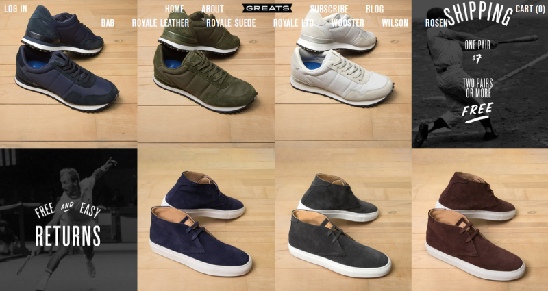
GREATS http://www.greats.com/
Greats is a New York based company which sells men’s footwear, mainly via their website. Their website is their showcase, thus every detail is studied and taken into careful consideration.
“Greats” opted for the utility of a grid layout. They’ve stacked their homepage with rows of modules and each module contains a pair of shoes. The modules all have similar sizes and their shape is implied rather than strictly marked out. Indeed, the user is encouraged to ignore anything other than the parade of shoes.
Single Screen Sites
The last trend we have been seeing a lot in the last 6 months are websites dominated by a background image that responsively always fits the screen. Usually, these sites are very plain and certainly tend toward a minimalistic design sense.
However, the signature feature of this design trend is their lack of a scrollbar: in other words, these websites almost always take a ‘single-page app’ approach to their UI.
Since the available content space is limited, the designer should have in mind a very clear hierarchy of content, and they should be especially discriminating when it comes to including less than highly relevant information.
In most cases, the image (or often even a video) dominates the design, leaving very limited space for other design ideas. It may demonstrate the product or it may simply be used to evoke a emotive, filmic feel.
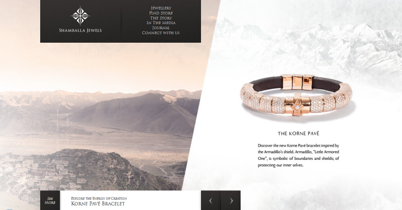
SHAMBALLA JEWELS http://www.shamballajewels.com/
“Shamballa Jewels” is a company which markets a range of jewellery. The website has a homepage which is composed by a unique page where some of their works are shown. There isn’t any scrollbar and the navigation in the site is granted by a menu at the top of the screen.
What I really like about this site is that the background keeps changing. Indeed images which fit the whole space are alternated with vertical split screens.
The examples above show that outstanding, effective design, doesn’t need to be tethered to the 4 or 5 most common layout patterns we see out there. Each one resisted the urge to start with the familiarity and safety of one of the popular grid/frameworks — and got a great result accordingly.
Does that mean the more common web layouts don’t work?
Of course not. But as Mark Twain’s said “To a man with a hammer, everything looks like a nail.”
Make sure you’re looking at a nail.
Frequently Asked Questions on Web Layout Ideas
What are some modern web layout design trends?
Modern web layout design trends are constantly evolving. Some of the popular trends include minimalistic design, asymmetrical layouts, split-screen layouts, and mobile-first design. These trends focus on creating a user-friendly experience, with easy navigation and engaging content. They also emphasize on visual appeal, with the use of bold colors, unique typography, and high-quality images and videos.
How can I make my website layout more engaging?
To make your website layout more engaging, focus on the user experience. This can be achieved by ensuring your website is easy to navigate, with clear menus and links. Use high-quality images and videos to grab the user’s attention. Also, make sure your content is relevant and interesting to your target audience. Incorporating interactive elements, such as quizzes or polls, can also increase engagement.
What is the importance of mobile-first design in web layout?
Mobile-first design is a design strategy that prioritizes designing for mobile devices before designing for desktop or other devices. This is important because more and more people are using their mobile devices to access the internet. A mobile-first design ensures that your website will look good and function well on all devices, providing a better user experience.
How can I use color effectively in my web layout design?
Color plays a crucial role in web layout design. It can set the mood, convey emotions, and even influence user behavior. To use color effectively, consider your brand identity and your target audience. Choose a color palette that reflects your brand and appeals to your audience. Use contrasting colors for text and background to ensure readability. Also, use color to highlight important elements or information on your website.
What is the role of typography in web layout design?
Typography is an essential element in web layout design. It not only communicates information but also sets the tone and personality of your website. Choose fonts that are easy to read and reflect your brand’s style. Use different font sizes and weights to create hierarchy and guide the user’s attention. Also, ensure there is enough contrast between the text and the background for readability.
How can I incorporate multimedia elements in my web layout design?
Multimedia elements, such as images, videos, and audio, can enhance the user experience and make your website more engaging. Use high-quality images and videos that are relevant to your content. Consider using background videos or animations to add visual interest. Also, use audio sparingly and provide controls for the user to play, pause, or adjust the volume.
What are some common mistakes to avoid in web layout design?
Some common mistakes to avoid in web layout design include cluttered layout, poor navigation, too many different fonts or colors, and not optimizing for mobile devices. Also, avoid using low-quality images or videos, and ensure your content is easy to read and understand.
How can I improve the usability of my website layout?
To improve the usability of your website layout, ensure your website is easy to navigate, with clear menus and links. Use consistent layout and design elements throughout your website. Also, make sure your website loads quickly and is optimized for mobile devices. Provide accessible features for users with disabilities, such as alt text for images and captions for videos.
What is the role of whitespace in web layout design?
Whitespace, or negative space, is the space between elements in a design. It can be used to create balance, guide the user’s attention, and improve readability. Whitespace can also give your design a clean, modern look. However, it’s important to use whitespace strategically and not leave too much empty space that can make your design look incomplete.
How can I keep my web layout design fresh and up-to-date?
To keep your web layout design fresh and up-to-date, stay informed about the latest design trends and technologies. Regularly update your content to keep it relevant and interesting to your audience. Also, consider redesigning your website every few years to keep it modern and engaging.
 Simone Sala
Simone is a graphic designer who loves technology, design and who is always looking for new trends and innovative concepts. He also likes to give tips and to share his knowledge with other tech-lovers.